Black, White, and Blue

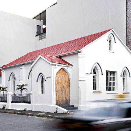
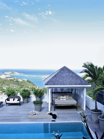
It is a very rainy day here in Charleston, and I think along the entire east coast, so I thought we could all take a trip to St. Barths. This home, featured in Italian Marie Claire, is the home of Copenhagen natives Marienne Brandi and Keld Mikkelsen. Instead of the traditional bright colors of an island abode, or a British colonial vibe a la India Hicks, Brandi and Mikkelsen have opted for a black and white color palate, relying on pops of color from the green vegetation. It’s certainly an exercise in restraint for the islands, but most certainly allows the view and the setting to take center stage. 
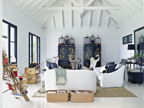
In addition to the simple black and white color scheme, the couple’s decorating style has a very tribal aesthetic – influenced by pieces of African art they have collected in their travels. 
The house is completely open to the outside – doors on almost every wall, and the subtle black and white scheme does not distract from the beautiful scenery. 
The vaulted ceiling in this traditional island cottage is beautiful, and the oversized raffia light fixtures are the perfect scale with the high ceilings. The kitchen is a reflection of the overall design scheme, with what seem like ebony cabinetry and simple lines. 

I couldn’t leave you without a shot of the mini bar, but look out the doorway to the right at that magnificent view. 
What an extremely chic and unexpected take on the island lifestyle – less focus on the decorating, more focus on the view. The black, the white, and the turquoise of the ocean. Anyone for a swim? 

Photos courtesy of Marie Claire Italia

More Color

Divine Intervention

I don’t think that I can go on and on enough about Marie Claire Maison! You all know how much I adore this French decor magazine … and this feature below is no exception!–Just wish I could read some French … What I gathered from my limited French is that this church below is in Cape Town, South Africa and was renovated by an Italian couple. 
It is very exciting that I came across this church, as my historic preservation studio project this fall involves coming up with a reuse of an historic chapel building here in Philadelphia. Churches can often be hard buildings to reuse, as their massing is very specific to their original use, and there are those who are superstitious enough to believe that sleeping in a church might be sacreligious. Not when the church is as fab as this one! 

All you lacquered lifers know how much I love the simplicity of an all white interior. Especially in a location such as Cape Town. In this space, the white interior allows you to appreciate the wonderful patina of the floors. 

Look at the rustic chic kitchen cabinets. The way that they extend all the way to the floor, instead of having a base, is very unusual–I love it. Makes it seem as though the cabinets really are part of the architecture, instead of an installed piece of furniture. 

How cool is that screen that divides the kitchen space from the eating space? What this does is allow for the delineation of spaces without disrupting the experience of the architecture of the building. Oh how I adore these beams! 

How would you like to sleep up in the rafters of this reused church? I am sure the view of the space and the experience of the architecture are absolutely divine. 

photos courtesy of Marie Claire Maison http://www.marieclairemaison.com

More Architecture

For the Love of Orange

What is it about fall and the color orange? I love orange all year round for the great hit of color that it can add to any space, however, in the fall I am especially keen on it.  I think it has something to do with the changing leaves, pumpkins, and the desire to shed the corals and the salmons of summer for something a little edgier. 
First thing a girl always thinks about when talking about a good color orange … Hermes gift boxes.  I’m not exactly sure whether that is because the gifts that come in these boxes are so fabulous, or whether the orange color of the box is really the chicest orange.  In any case, the chicken or the egg syndrome. Whenever I hear someone describing something they purchased that was orange or something orange that they are planning on wearing, it always seems that they try to justify it by describing it as “Hermes Orange.” No need to justify, orange is ahhmazing. 
Martha Stewart
Ahh pumpkins. It really brings back memories doesn’t it? Although I absolutely love an orange pumpkin (obviously)–check out what Eddie Ross did to the pumpkins in his table setting for Lonny
Lonny
Instead of simply using predictable pink in her daughters’ bedroom, interior decorator Palmer Weiss jazzes it up with orange headboards. 
Apartment Therapy
Why not paint the floor orange? Terrific idea. You lacquered lifers know how I am a sucker for a good lacquer job. 
Pure Patina
In the office of my friend, and Charlotte-based interior decorator Kristen Cone, she used orange as a contrast against her industrial bookshelves and gray walls. Check out more photos on her blog here

Time to add some orange into your life, don’t you think? JCrew sail bag, $198.

And for the “Cheap and Chic of the Week,” Urban Outfitters 2×3 rag rug, $14

More Color